
We’ve all heard the phrase, a picture is worth a thousand words. We believe, when advising your clients on their businesses, graphs and charts have the same impact on numbers. Graphs and charts condense large amounts of information into easy to understandable formats that can clearly and effectively communicated. With approximately 65% of people being mainly visual learners, meaning they easily pick up information with their eyes and prefer to be taught something by seeing it in a graphical manner. This is especially relevant when there is a lot of data and complex material to understand. Delivering information that’s pertinent to their business and in a visual way gives your client the greatest chance of understanding, implementing and valuing your advice.
Whether you want to make a comparison, show a relationship, or highlight a trend, they help your clients "see" what you are talking about. When you’re selecting how to best present your data, think about the purpose of your graph or chart and what exactly you are trying to convey. Then decide which variables you want to include and whether they should be expressed as frequencies, percentages, or categories.
To help you make the best selections we’ve got a lowdown on the most common business programs and how you can display them graphically:
Wanting to visualise and compare trends for businesses?
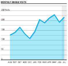
If you’re wanting to show trends in a business, and identify whether two variables relate to (or "correlate with") one another a line graph is perfect.
They can also depict multiple series, for example, having different trend lines for different product categories, time comparisons, or store locations. It's easy to visualise and compare trends when they're represented on the same graph.
For example:
- How do sales vary from month to month?
- How many unique visits does your client’s website get each month?
- Cost of sales, this year versus last year.

Want to demonstrate things on a discontinuous scale for the business?
If you’re wanting to demonstrate data from a client’s business that is discontinuous, bar graphs are fantastic.
For example:
- Client’s most popular website pages
- Different regions cost of sales


Wanting to show a percentage relationship for a business?
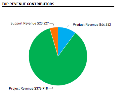
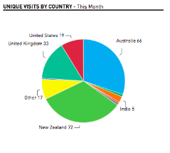
If you’re wanting to demonstrate a ratio or percentage relationship for a client’s business a pie chart is a great tool. The visualisation allows you to quickly depict what is contributing to the whole and on what scale.
For example:
- Which sources created what percentage of the whole revenue for your client?
- Which country made up the highest percentage of your client’s website visits for a month?
Next time you find yourself wading through piles of numbers or analysing relationships between variables for clients - stop and consider how you could summarise the information you are gathering. How could you amalgamate this information so that your conclusions and advice are clearly understood?
We strongly believe in doing this here at Spotlight Reporting, that’s why our tools are designed specifically for accountants looking to transform the way they deliver advisory services to their clients. There are many chart, graphical and diagram formats you can choose from within Spotlight when representing information graphically. We can even customise them for you, so you have the exact format you’d like. Each graph can be worth a thousand numbers to your client!